
The NBA's Icon Jerseys, from worst to best
- Dale Taylor
- Jun 19, 2020
- 9 min read

For years now we have wanted to jump on here and voice our opinion on the NBA's uniforms. There are some teams that are trend setters and really at the forefront of jersey design. Other teams seem to put little thought and effort into their teams threads. Here are the NBA's Worst to Best Icon jerseys: 30 - Charlotte Hornets

These are awful. Their look was cutting edge when it first came out and attracted a lot of interest... in 2014. Now in 2020, the Hornets have joined the growing list of franchises throwing an abbreviation on their jersey and sending the kids out to play. Dated design, tacky 3 letter abbreviation (in oversized lettering).
Grade: F
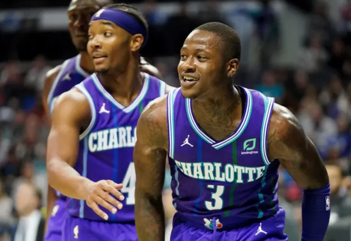
NOTE:
We do have to give them plenty of credit for their city jerseys - a throwback to the 90s, a time when this franchise's uniforms rocked, as did their teams.
29 - Cleveland Cavaliers

Another uniform that had plenty of admirers when they first came out. These uniforms were praised for their simplicity and were a welcome change from their wine and gold uniforms. However, these dated very quickly. The chunky, block font and jagged numbers are a bad combination. It leaves us to think what could have been, as the colour scheme is actually really classy.
Grade: D-
28 - Phoenix Suns

Phoenix somewhere along the line have gone off track. The 90's saw the glory days of Suns uniforms, with the Barkley era and the bursting basketball sun across the front. Kids would proudly wear these to school and pretend to be the Round Mound of Rebound. These days, their uniforms are nothing buy a promising colour scheme. So much could be done with the purple and orange. It wouldnt take too much to turn this around. Some black splashed in rather than the white and a new "Phoenix" font'alone would see this soar up the rankings. For now though, it sits at 28.
Grade: D
27 - Washington Wizards

Washington are one team that has very rarely had a nice uniform. The Gilbert Arenas era divided fans with the gold and black, in your face, dazzle fabric uniforms. These uniforms aren't THAT bad, they are just dated (again). They are already experimenting with their other jerseys - hopefully they can find one to replace this as their everyday uniform.
Grade: D+
26 - Sacramento Kings

These uniforms frustrate me. The colour scheme is great, it works very well. The massive block letters across the front - not so much. With a little work these could be really quite classy and nice. "Kings" in a nice cursive font or similar would dress this up nicely and transform it from bulky and rude to classy and sleek
Grade: D+
25 - Los Angeles Lakers

These are rude. The black side panels are offensive and something we haven't seen before on a Lakers kit. Had we talked about the home strip I would speak a lot more fondly of it, being a throwback to the showtime days, done very tastefully. These just look out of place. Yellow side panels, although a bit more boring, would have looked a lot nicer.
Grade: D
24 - Golden State Warriors

Some people really like this uniform. I guess it's not all that bad. It's been around a long time and really needs an update. We would love to see a throwback mashup to the Chris Mullin era, with the "Warriors" splashed across the front. But hey, that's just our two cents.
Grade: C-
23 - Detroit Pistons

Yawn. This hasn't seen an update since Ben and 'Sheed Wallace donned a Pistons jersey. It's not a bad design by all means, but come on guys - give the fans something to enjoy! Their experiments with their statement and city jerseys appear as if they are searching for something to replace it, but for now we are stuck with this.
Grade: C-
22 - Philadelphia 76ers

These are a nice, plain, simple jersey. No frills. Nothing stands out as a flaw or a feature. We don't even mind the abbreviated "PHILA", which we have seen to take offence to earlier in this article. These are however not very exciting at all, which is why they land in the middle of the pack.
Grade: C
21 - Memphis Grizzlies

In a slighty worse version of years previous, these Memphis uniforms are not too bad. Just that... not too bad. Extremely simple design, fairly boring features, but a really classy colour scheme, which they have always had. Memphis have had some ripping designs over the years, this just isnt one of them.
Grade: C

NOTE:
The use of the throwback city jerseys has been met with open arms. Highly regarded as one of the best uniforms in NBA history, the colours were updated for the throwback and look even better than the original.
20 - Toronto Raptors

What do I like about this uniform? Not much. What do I dislike about this uniform? Not much. The small block lettering is a little out of place when compared to the completely different style of number font. Outside of this, it's a pretty plain design. There is plenty of room for improvement here.
Grade: C
19 - OKC Thunder

Nothing particularly to dislike about this uniform. This is the look they have run with since the franchises inception in 2008. It's not really the stuff a classic uniform is made of. It's more of a trend design and has a lifespan on it. We feel like this has well surpassed it's use-by-date. A fresh look would serve this franchise nicely!
Grade: C
18 - Indiana Pacers

These uniforms have a real College feel to them. Team name in a circle is something no other team has done... and probably for good reason. The front of this uniform becomes very text dominant and overpowers the jersey. Aside from this, the uniform is great. Unique, modern and has a colour scheme that works very well. I do wonder if this is one we will get tired of seeing in a year or two, but for now it's easy on the eye.
Grade: C+
17 - Orlando Magic

A new take on an old design. This subtle change from blue to black as the primary colour is a welcome change. These offer a sense of class, with nicely matched fonts and use of colour. They do have a bit of a pinstripe suit feel to them though, don't they?
Grade: C+
16 - Minnesota Timberwolves

People went nuts for this look when it first hit the scene in 2017. They were a fresh, sleek new look with the 2-blue theme as a first for the franchise. This is really a trendy design and may not age well, but we could be wrong. For now though, they are pretty nice! We would LOVE to see a throwback to the KG "treetop" design though!
15 - Brooklyn Nets

When the New Jersey nets migrated to Brooklyn, they adopted a fresh new look, It was a crisp, black and white, simple jersey. Does it sound like i just described their current jersey? It should, because it's still the same. What once was a modern, classy new look now just looks a little boring and underwhelming. That isn't to say it looks bad in the slightest, because they don't at all. We would just love to see something fresh for these guys.
Grade: B-
14 - Dallas Mavericks

The Mavericks have had some bad... really bad uniforms in their time (who can remember the shiny silver dazzle uniforms?). This isn't one of them. The Mavs stuck with their same old design that many fans are tired of. They are a neat, professional design, which all in all looks pretty decent. The design was unveiled in 2001, originally with navy as the primary colour. They changed to the light blue as the dominant colour in 2010 and have run with it ever since. Recently though, the blue has been changed to more of a royal blue, which we like less than the lighter blue the Mavs won a 'chip in (2011) Grade: B-

NOTE: When we make a top 10 WORST NBA uniforms ever made, these will surely be a contender.

NOTE: Credit must be given for their city uniforms. We thought we would hate these, and we do hate the MAVS font on the front. But these look terrific out on the court. We hope the use of the blue and green can be factored in to a regular design in future.
13 - Denver Nuggets

Had we have been talking about their home kit, this uniform would feature lower... A LOT lower. Their home kits look below average. The away kit doesn't look too bad though. Designed as a classy, simply design, they serve this purpose fairly well. The use of the burgundy, as small as it is - is too much though.
Grade: B-
12 - Miami Heat

This uniform really suits the city. The contrast of black and red has been a staple in Heat designs for as long as I can remember. This design has been around for a long time now though - around 1999 to be exact. But I think we are OK with it. It borderline has the makings of a classic design, which would be used year after year.
Grade: B
11 - New York Knicks

The first of the real classic uniforms in this countdown. The Knicks have sported this look for years and years, only modifying small parts to keep it modern and relevant in today's age. A unique colour scheme, basic design - the Knicks are hard to mistake for anyone else and that is a good thing. The city uniforms however we could criticize fairly heavily, but this isn't a city uniform countdown luckily.
Grade - B
10 - Utah Jazz

The Jazz are a franchise that have always had good uniforms. They had one of the best basketball teams and best basketball uniforms with the "Mountains" designs in the mid 90s. Most other designs have featured their famous Jazz word mark on the front of the jerseys. These are by far not their best jerseys, but they are neat, professional and contain the Jazz word mark, which is enough for them to secure the 10 spot. At some stage (hopefully soon), they will need to back the famous Mountain design though.
Grade: B
9 - Houston Rockets

At long last, the Houston Rockets ditched that awful "rocket side panelling", which T-Mac and Yao, as well as Harden donned. This one for years one of the worst uniforms in the league. They have switched things up to a sleek red/white/black colour scheme and we think it does the job nicely. Still plenty of room to improve though, the red/black arm trims could have matched the neck (whichever way they did it). A few other minor changes could see a classic be born!
Grade: B+
8 - Los Angeles Clippers

Maintaining their interesting and different use of white and red on the shorts, we think this simple design is one of the better designs in the league. Nothing is over done or over the top. The white/red on the shorts is enough to keep this uniform interesting but classy.
Grade - B+
7 - Atlanta Hawks

The thing we like the most about this uniform is the stunning colour scheme. The bright red and fluro yellow/lime, combined with black really does stand out well. The design isn't horrible either. The geometric pattern on the top and shorts could be dialled back a little, if anything, so that it was a little more subtle. Other than that, there is very little to dislike about this uniform.
Grade: A-
6 - Portland Trailblazers

"How did the Blazers get so high on their list? Their uniform is the same as it has always been!"
Exactly. Why mess with a good thing? These uniforms are iconic of Portland and would be a crime to change them. The Blazer's stripes are unique as no other team has a design like them. This would be a hard look to replicate and pull off successfully. I think this is one of the reasons the Blazers haven't messed with it too much over the years.
Grade: A-
5 - San Antonio Spurs

Another design that comes under the "If it ain't broke, why fix it?" theme. This design has no age, It has been around for years. The wordmark "Spurs" across the chest is done tastefully and doesn't overpower the jersey. The black/silver/white colour scheme works so well.
Grade: A-
4 - New Orleans Pelicans

Classy Colour scheme - ✓
Interesting and different font - ✓
Basic but classy design - ✓
The Pelicans have had nice designs in their short existence. None better than their 2020 away kit though. The gold and navy go great together. Throw in a splash of red and you have a really classy colour scheme. The design is not a new one, but is subtle enough to not require change every couple of years. This is one of our faves.
Grade: A
3 - Milwaukee Bucks

The Bucks have has some very average uniforms in the past and even the present. Their city uniforms from last year were among the league's worst. Their current away strip however is one of the best on offer in the NBA. Designed to bring an old design into this century, the side panelling is done well enough to not stand out like a sore thumb and allow the colours do the talking. The forest green and cream colour scheme worked so well in fact, that the cream colour got its own uniform in this year's city uniform. This is a classy uniform and will remain so until the cream goes out of fashion.
Grade: A+
2 - Boston Celtics

Timeless. Simple. Elegant.
Lakers - take note.
These may have been around longer than most of us have been on this earth, but they remain one of the best uniforms in the league. With the NBA's updated cut, these immediately look modern, yet remain the iconic same design from Boston that we are used to.
Grade: A+
1 - Chicago Bulls

This is probably the one uniform all non-basketballers can identify. Michael Jordan and the 90's Bulls made history in these jerseys. They created a legacy in these jerseys. They are the most iconic uniform in NBA History and still hold up as a masterpiece of design. So simple, yet look amazing on the court. The current day Bulls might not be much good, but their uniforms sure are.
Grade: A+
How did you think we went? Let us know in the comments below if we got one wrong!
If you need quality basketball uniforms for your local team, let us know at www.taylorteamwear.com.au


Comments